Next my journey took me to Cambridge. On Friday 20th October I conducted a workshop at the British Antarctic Survey headquarters in Cambridge with John King, Robert Mulvaney, Matthew Polaine, Beatrix Schlarb-Ridley (BAS) and Lachlan Urquart.
I drove from our boat on the River Lee (where I live part-time when not in Nottingham), through North East London and out along the motorway past the flat eastern fields, villages and towns of Essex and Cambridgeshire to the place of hallowed halls of learning and research, and our Silicon Valley, and the headquarters of our presence in the Antartica. Here is the doorway to that truly wild and remote landscape at the end of the world – snow, ice, glaciers and penguins.
The aim of the workshop was to explore what Performing the Future might mean in response to scientific research taking place in the Antarctic, looking at past, present and future climate data and how we might find ways to represent and respond to this data outside of a scientific context – in ways that might still encourage positive visions of the future.
We focused our discussions and experiments on issues of uncertainty and complexity – asking questions such as:
- can the data help us?
- how can we represent scientific uncertainty to the public whilst maintaining trust in scientific methods (and specifically climate models)?
- how do we represent the factors of uncertainty in science that are led by human behaviour?
- how do we represent complex models?
- what language do we need to use to represent complexity and uncertainty?
This was supported by a fascinating presentation by John King who discussed the difficulties of creating climate models in the Antarctic based on sea ice, how the sea ice is increasing in the Eastern parts of the region, which goes against expectation and the evidence from the Arctic at the North Pole where sea ice and glaciers are melting faster than expected. John also explored the contributors to uncertainty in climate science, which he outlined as:
- climate models are unable to include all processes (as the earth’s climate is so complex and scientists are still learning about natural forces)
- some natural forces are more predictable than others (e.g. solar cycles are more predictable than volcanoes)
- climate change has been forced by fossil fuels and is therefore dependent on human behaviour rather than natural forces so climate models quickly hit the line of science and become reliant on economics, social science etc…
- once you add human behaviour to a deterministic system you quickly reach uncertainty and chaos
I also presented my work on engaging the public with climate data, complexity and uncertainty and we explored strategies for presenting data from John and Robert’s research through a series of experiments and discussions.
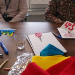
Firstly I asked each of us to make a representation of a key part of our research, without using words, texts or a graph. I had brought a variety of materials including card, clay, coloured felt material, pens, scissors, glue and I invited everyone to use whatever material they felt might represent their research as a tangible, sensory, symbolic meaningful experience.
The representations that were then presented by each one of us were:
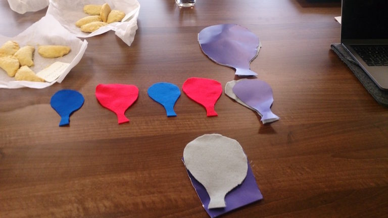
Balloons representing CO2 levels through colour, a game to show how hard it is to predict what will happen next (with the colours representing high or low levels of CO2). The size of the balloon represented atmospheric CO2 levels and the colour global temperature through a sequence of glacials (cold, low CO2 = small blue balloons) and interglacials (warm, higher CO2 = larger red balloons). Later three additional grey and three purple balloons were added representing possible futures – which one we end up with is up to us!
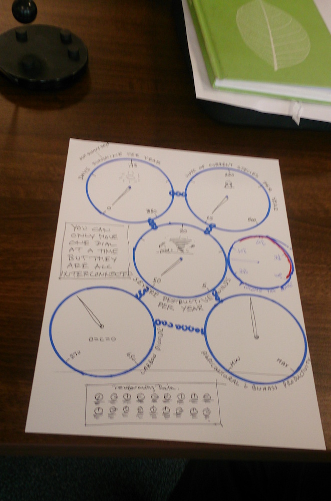
A machine with dials that represent different elements of climate change, you can only change one dial but they are all interconnected so each of them change. Additional dials and datasets where added as the drawing was passed around, reflecting different perspectives in relation to the data, including economic options such as raising income tax.
 A landscape of the Antarctic on one side and an urban environment on the other, representing the difficulties we have in connecting to the Antarctic/polar regions if we have never been there. Added to this was a sea that connects both landscapes as well as satellites that captures data about the Antartica and a TV set that presents the connections between the two to the world.
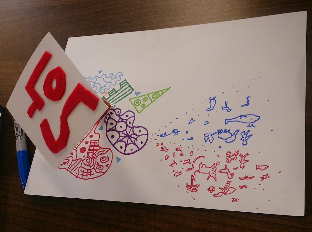
A drawing representing the difficulties of communicating complex research and how you might make decisions in response to evidence that might represent chaotic or uncertain situations. Added to this drawing was the numbers 405 breaking through which is the global CO2 levels recorded in 2017 and images of animals and biodiversity, considering the chaos this might bring to life on Earth.

A drawing of three squares representing the receding sea ice in the Artic and increasing areas of ocean (as well as the increasing sea ice in the Eastern Antarctic if you turn it around). With drawings representing the uncertainty for penguins and fish added to it and a new ocean with a ship breaking through, with a dollar sign indicating future profits from the receding ice.
I then asked each person to pass their representation to the person on their right (following the rules from the game of consequences) so that the next person could add a layer, perspective or interpretation of their own, creating multilayered and sometimes contradictory representations of each of the themes.
The final activity of the day was to begin to imagine how these themes might inform a ‘future machine’ – some kind of experience that used the strategies we had explored and discussed earlier in the day to represent uncertainty and complexity of the data in terms of people’s everyday lives here in the UK.
Two ideas were discussed:
Firstly looking at how changes in the Polar regions might impact on people living on the coast as sea level rise, thinking about citizen science and how people might help discover changes in the data, possibly also twinning locations in the UK with locations in the Antarctica.
The second group focused on the concept of the dial machine and what it would mean to build a machine that represented the process of modelling climate in the Antartica. People might ask the machine a question (for example to help with a decision about their lives) by turning a dial that would in turn change all the other dials and represent the uncertainty/complexity and interconnectedness of each of the datasets that the dials represented.
Future work was discussed including the possibility of doing a public talk about science and uncertainty in February 2018 when The Prediction Machine goes to Cambridge Central Library, and looking at possibilities to create an artwork based on some of the ideas developed in the workshop.